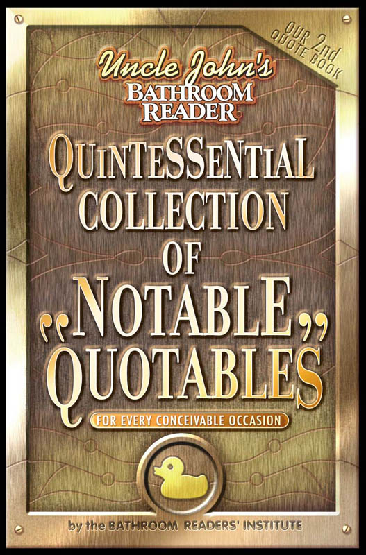

My first version of this cover featured the typography
as part of a STAINED GLASS WINDOW. For this reference book,
I wanted the feeling of a large public library window.
That idea did not fly . . .
I suggested as an alternate, an etched metallic plaque
fixed to the library wall.
I decided to KEEP the copper spacers that had been designed
for the stained glass window.